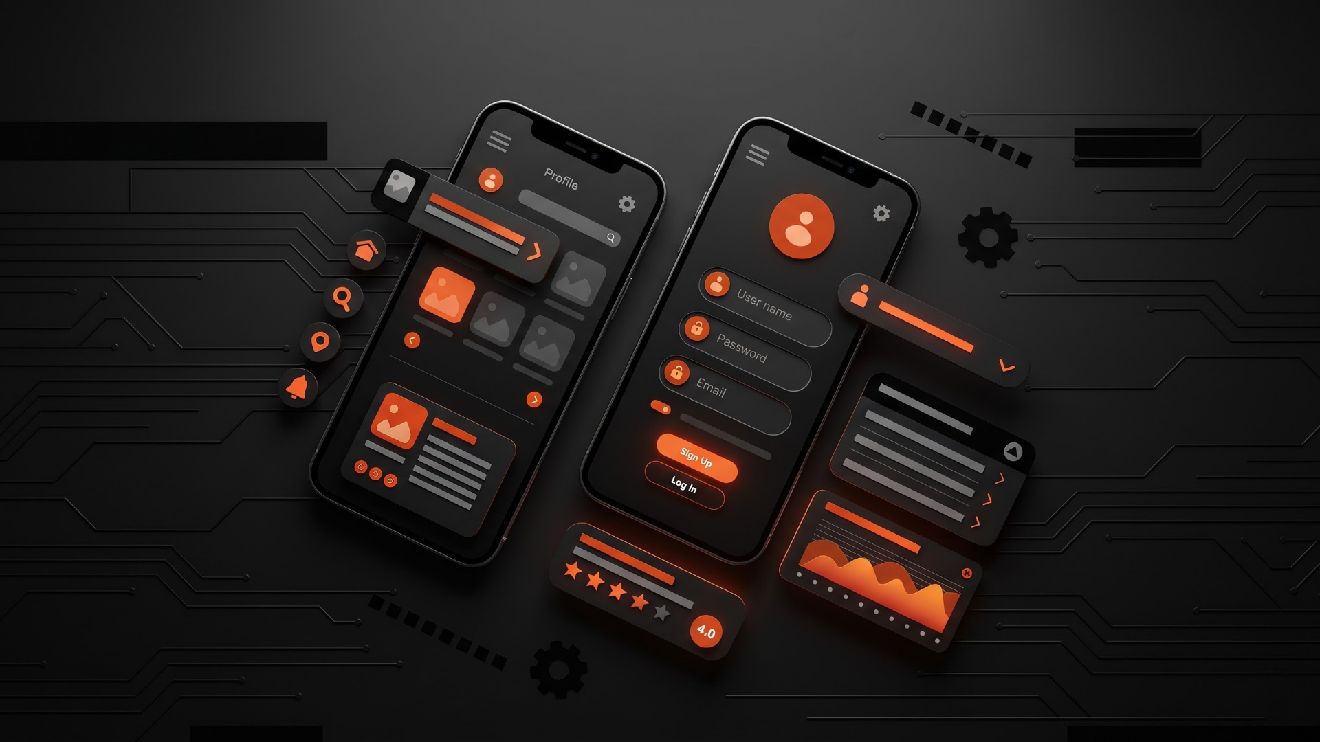
In the competitive realm of mobile app development, prioritizing user experience is a strategic imperative. By embracing these UX design principles, designers can create mobile apps that resonate with users and stand out in a crowded marketplace.
User-Centered Design: Putting Users First
The cornerstone of effective UX design for mobile apps is adopting a user-centered approach. This involves understanding the target audience, their preferences, and behavior. Conducting user research, surveys, and usability testing can provide valuable insights into user needs and expectations. By prioritizing user feedback, designers can create an app that aligns with the users’ mental models, making it intuitive and easy to navigate.
Simplicity and Clarity: Less is More
One of the golden rules in UX design is to keep things simple. Mobile app users often have limited time and attention spans, making it crucial to present information in a clear and concise manner. Avoid cluttered interfaces and unnecessary features that can overwhelm users. Prioritize essential elements, streamline navigation, and use straightforward language to guide users through the app seamlessly. By minimizing complexity, designers can enhance user comprehension and overall satisfaction.
Intuitive Navigation: Guiding Users Effortlessly
Intuitive navigation is key to a positive user experience. Mobile app interfaces should be designed with a logical and predictable flow, allowing users to navigate effortlessly without feeling lost. Implement recognizable icons, organize content in a hierarchical structure, and ensure that the navigation patterns align with users’ mental models. Consistent placement of navigation elements across the app contributes to familiarity, reducing the learning curve for users.
Responsive and Adaptive Design: Catering to Diverse Devices
With the multitude of mobile devices available, including various screen sizes and resolutions, it’s crucial for mobile apps to adopt responsive and adaptive design principles. This ensures that the app provides a consistent and optimal experience across different devices. Responsive design allows the app interface to adjust dynamically to varying screen sizes, while adaptive design tailors the user experience based on the specific characteristics of each device. This approach guarantees a seamless and visually pleasing interaction for users on smartphones and tablets alike.
Feedback and Affordance: Keeping Users Informed
Providing timely and meaningful feedback is essential for user engagement. Users should be informed about the outcome of their actions, whether it’s a successful form submission, an error in input, or the completion of a task. Visual cues, such as animation or color changes, can be employed to signify different states and guide users through the app’s functionality. Additionally, affordance—making interactive elements visually suggestive of their functionality—enhances user understanding and encourages interaction.
Consistency Across Platforms: Unifying the User Experience
In an era where users seamlessly switch between various devices and platforms, maintaining consistency in design elements is crucial. The visual and interactive elements of a mobile app should align with the overall brand identity and remain consistent across different operating systems (iOS, Android) to provide a unified user experience. Consistency fosters a sense of reliability and familiarity, making users feel more at ease when transitioning between devices.
Performance Optimization: Speed Matters
User patience is limited, especially in the fast-paced world of mobile apps. Slow loading times and laggy interactions can lead to frustration and a high bounce rate. To mitigate these issues, designers must prioritize performance optimization. This includes compressing images, minimizing the use of resource-intensive animations, and optimizing code. A swift and responsive app not only enhances the user experience but also contributes to increased user retention and satisfaction.
Accessibility: Inclusive Design for All Users
Accessibility should be a fundamental consideration in mobile app design. By adopting inclusive design practices, designers can ensure that the app is accessible to users with diverse abilities and needs. This involves providing alternative text for images, implementing a logical tab order for keyboard navigation, and offering adjustable text sizes and color contrast settings. Prioritizing accessibility not only expands the app’s reach to a broader audience but also reflects a commitment to inclusivity.
Gestural Design: Utilizing Natural Interactions
As touchscreens dominate the mobile landscape, leveraging gestural design principles can enhance the user experience. Designers should incorporate intuitive gestures, such as swiping, pinching, and tapping, to mimic natural interactions. However, it’s crucial to strike a balance between innovation and usability—gestures should be discoverable, consistent, and not overly complex. Intuitive gestural design adds a layer of interactivity that aligns with users’ expectations and contributes to a more engaging mobile experience.
User Onboarding: Seamless Introduction to the App
First impressions matter, and effective user onboarding sets the tone for the entire mobile app experience. Design a user-friendly onboarding process that introduces key features, benefits, and functionalities gradually. Consider incorporating interactive tutorials or tooltips to guide users through the app’s interface. A seamless onboarding experience not only reduces user frustration but also increases the likelihood of users exploring the app’s full potential.